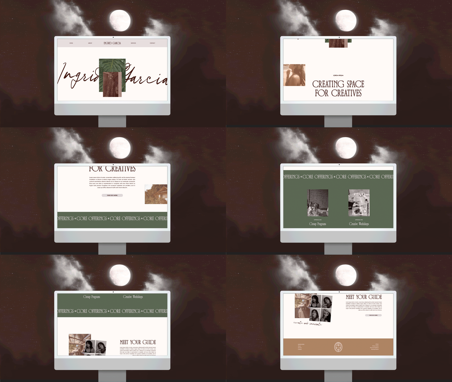
Ingrid Garcia is a holistic wellness facilitator currently based in Mexico (but often nomadic!). She works specifically with aspiring and existing creatives. Through a unique blend of holistic wellness, spirituality and creativity, she helps her audience dig deep to uncover their soul’s calling, say yes to themselves and take risks like never before.
Chosen Offering: Divine Origins
Business Category: Service-Based & Personal Brands
Industry: Holistic Wellness
Location: Mexico | USA
Ingrid’s audience seeks authentic self-expression and growth but feels held back by fear. Drawing from her own experiences, Ingrid envisioned her brand as a trusted guide, inspiring others to explore, take risks, and embrace their true desires. We crafted a visual narrative that subtly conveys, “I’ve been where you are, and I can guide you through.”
Ingrid wanted her brand to have a rugged, boho adventurous side to it, blended with a poetic, dreamy and spiritual essence. The entire brand was built around achieving this blend - harmoniously combining contrasting elements of light/dark, earthy/ethereal, masculine/feminine throughout every brand asset and touchpoint.
When crafting the brand colour palette, the blend was the primary focus - we wanted to find the sweet spot between inviting and invigorating. We have used specific colours to evoke emotional and psychological responses that align with Ingrid’s/the brand’s goals.
‘Mythical’: Soft, nurturing, and spiritual, symbolising wisdom and creativity.
‘True Desires’: Bold and passionate, reflecting courage, intimacy, and connection.
‘Sun Beam’: A bright neutral, suggesting freedom, new possibilities, and space to innovate.
‘Terracotta’: Grounded, warm and authentic, fostering trust, and emotional depth.
‘Evolution’: Nature-inspired, promoting growth, self-exploration, and calm transformation.
The primary logo reflects strength, adventure, and courage through the use of uppercase letters. It was then softened with fluidity and movement to add an inviting, easeful and airy feel, the G’s were uniquely styled to reinforce this theme— this is equally a nod to Ingrid’s Libra rising sign. The submark logo features a bespoke balance scale illustration, symbolising Libra and subtly indicating to the audience that the Ingrid Garcia brand is the perfect balance of everything they’ve been searching for. To maintain cohesion, the G’s from the primary logo was integrated into the submark.
Lastly, we developed bespoke illustrations for Ingrid to use throughout her brand assets and touchpoints.


